Teaching City Oshawa
Teaching City Oshawa
Teaching City was a collaborative initiative done with the City of Oshawa for my final semester. We where tasked with creating a navigation system for the newly built Ed Broadbent Park. Split into UX/UI and web development teams, we handled design and programming respectively. The UX/UI work included wireframes, logo design, user workflows, journeys, and empathy maps. My role was designing the main navigation map for the application navigation system.
Feb 3, 2025
Click to View Project
CLIENT
City of Oshawa/ Durham College
CLIENT
City of Oshawa/ Durham College
CLIENT
City of Oshawa/ Durham College
Role
UX/UI Designer
Role
UX/UI Designer
Role
UX/UI Designer
Design Process
Design Process
Design Process
The user interface was designed to be clean, intuitive, and visually engaging, ensuring that visitors could navigate the application effortlessly. Inspired by the welcoming atmosphere of Ed Broadbent Park, the design incorporated a carefully chosen colour palette, readable typography, and clear iconography that guided users naturally through the app.
The teams vision was to purposefully design the User flow to balance functionality with aesthetic appeal, creating an interface that not only looked polished but also delivered a seamless, enjoyable user experience for all User alike. AODA and accessibility took top priority in user flow development and design.
UI Development Stages
UI Development Stages
UI Development Stages
Wireframe & Development Stages
The design process started off with a structured approach, beginning with Flowchart Development. During this initial stage, we mapped out the user journey and outlined the app’s functionalities to create a logical and intuitive user flow. This allowed us to identify key touchpoints , streamline functionality, and eliminate potential pain points for users early in the process. It was during this stage that the team started brainstorming and finalising brand colours, fonts, and the overall brand identity.
Low-Fidelity Wireframe Development
We translated our ideas into simple, functional layouts. These wireframes focused on structure and user interaction rather than detailed visuals, allowing us to test navigation patterns, adjust layouts, and refine the app’s flow before committing to a final design. During this stage, we explored multiple logo design concepts, ensuring they reflected the purpose and personality of the application.
High-Fidelity Wireframe Development
Basic layouts where transformed into detailed, realistic screens. We incorporated the finalised colour palette, typography, and imagery to create a true-to-life representation of the final interface. This stage was also where our collaboration with the web development team became crucial—ensuring that the visual design aligned seamlessly with technical requirements. The high-fidelity wireframes acted as a complete blueprint for the development team, setting the stage for smooth implementation and a polished final product.
My Role
My Role
My Role
Map Design and Development
My main responsibility as part of the UX/UI design team was to design the main navigation map for the application. This map was to serve as a scrollable and zoomable vector map graphic on the user interface of the home page.
The map was designed using Adobe Illustrator. My primary focus was maintaining AODA standards and accessibility, all the while making the map effectively depict the terrain to all users alike. After desiging the structure of the terrain my focus shifted on to the icons and graphical elements placed on the map. These include trees, benches, bushes, bicycle racks etc. I found it especially challenging to maintain a consistent visual style while keeping it engaging and effective.
Accessibility and AODA considerations
The map was developed with accessibility in mind using high-contrast colours, clear labelling, and universally recognisable icons—to make navigation straightforward for all users. As designers we understood that users of all ages and cultural backgrounds will be visiting the park. Including those with visual impairments. This approach ensured that visitors could quickly orient themselves and find their desired locations within the park.
Logo Iterations
Logo Iterations
Logo Iterations
The process of designing the logo began by brainstorming for icons and imagery that suited the brand voice and effectively communicated the motive of the application.
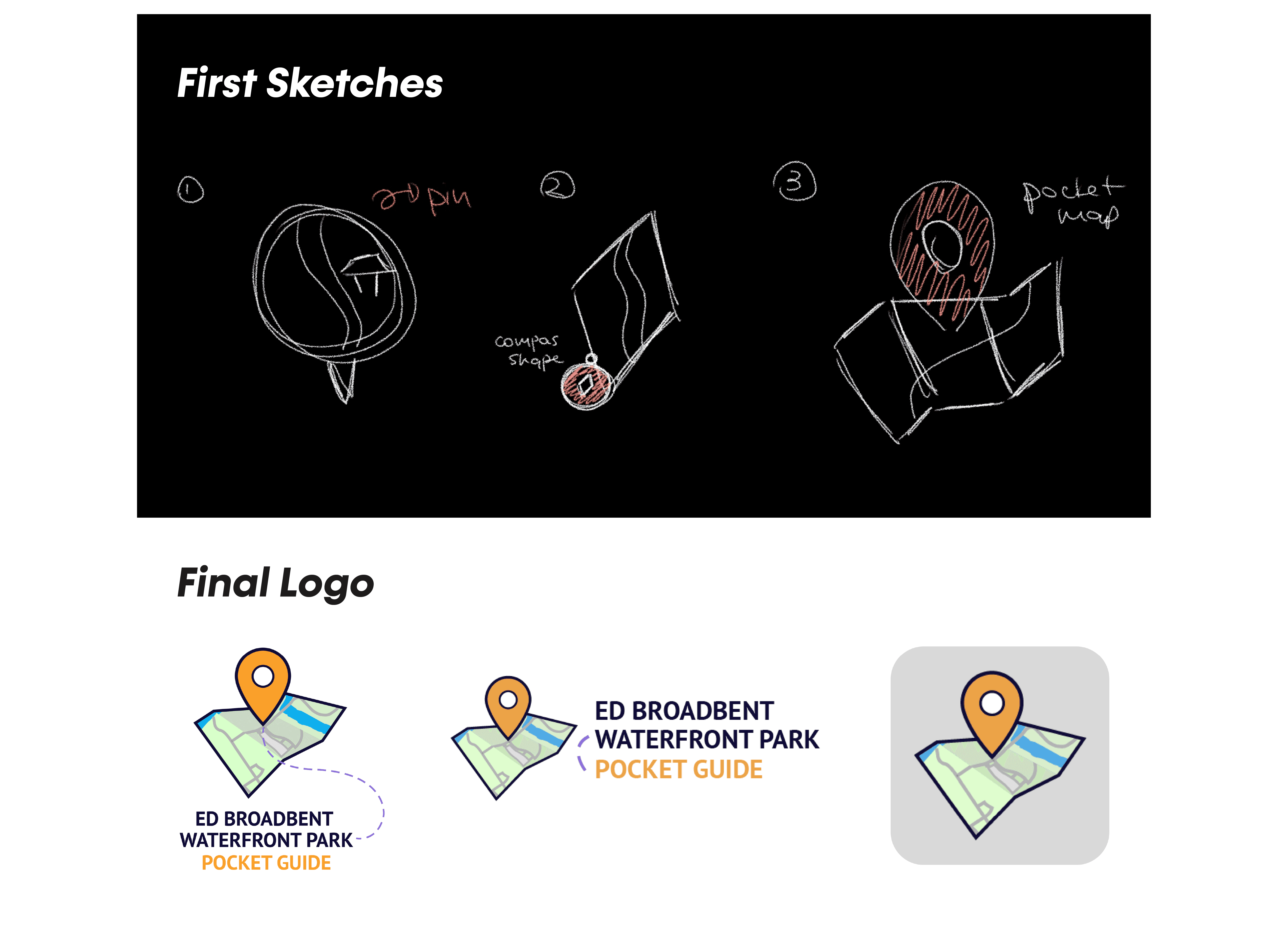
First Sketches
The first sketches of the logo included a circular navigation arrow, a compass and a 3D depiction of a map with a navigation arrow attached to it. These images, Icons and design ideas were brainstormed by the entire team to maximise creative output.
Final Logo
After much discussion and weighing of pro and cons, we finally came to a discussion that the logo would be a 3D map with a navigation icon. The map on the logo would be the original map used in the navigation screen. The team decided that we would be using 3 variations of the logo for different instances and platforms.
The logo Icon with the Tyface
The logo Icon and the typeface horizontally
The Logo icon as a standalone logo.
The process of designing the logo began by brainstorming for icons and imagery that suited the brand voice and effectively communicated the motive of the application.
First Sketches
The first sketches of the logo included a circular navigation arrow, a compass and a 3D depiction of a map with a navigation arrow attached to it. These images, Icons and design ideas were brainstormed by the entire team to maximise creative output.
Final Logo
After much discussion and weighing of pro and cons, we finally came to a discussion that the logo would be a 3D map with a navigation icon. The map on the logo would be the original map used in the navigation screen. The team decided that we would be using 3 variations of the logo for different instances and platforms.
The logo Icon with the Tyface
The logo Icon and the typeface horizontally
The Logo icon as a standalone logo.
Navigation Icons
Navigation Icons
Navigation Icons
The navigation icons for the app were considered to be as important as any other component of the application. The team member responsible for the icons consulted the rest of the team regarding the icons. The main topics of discussion were accessibility and the effectiveness of communication through imagery. The icons designed prioritized using fundamentally understandable imagery to depict locations and activities on the park grounds.
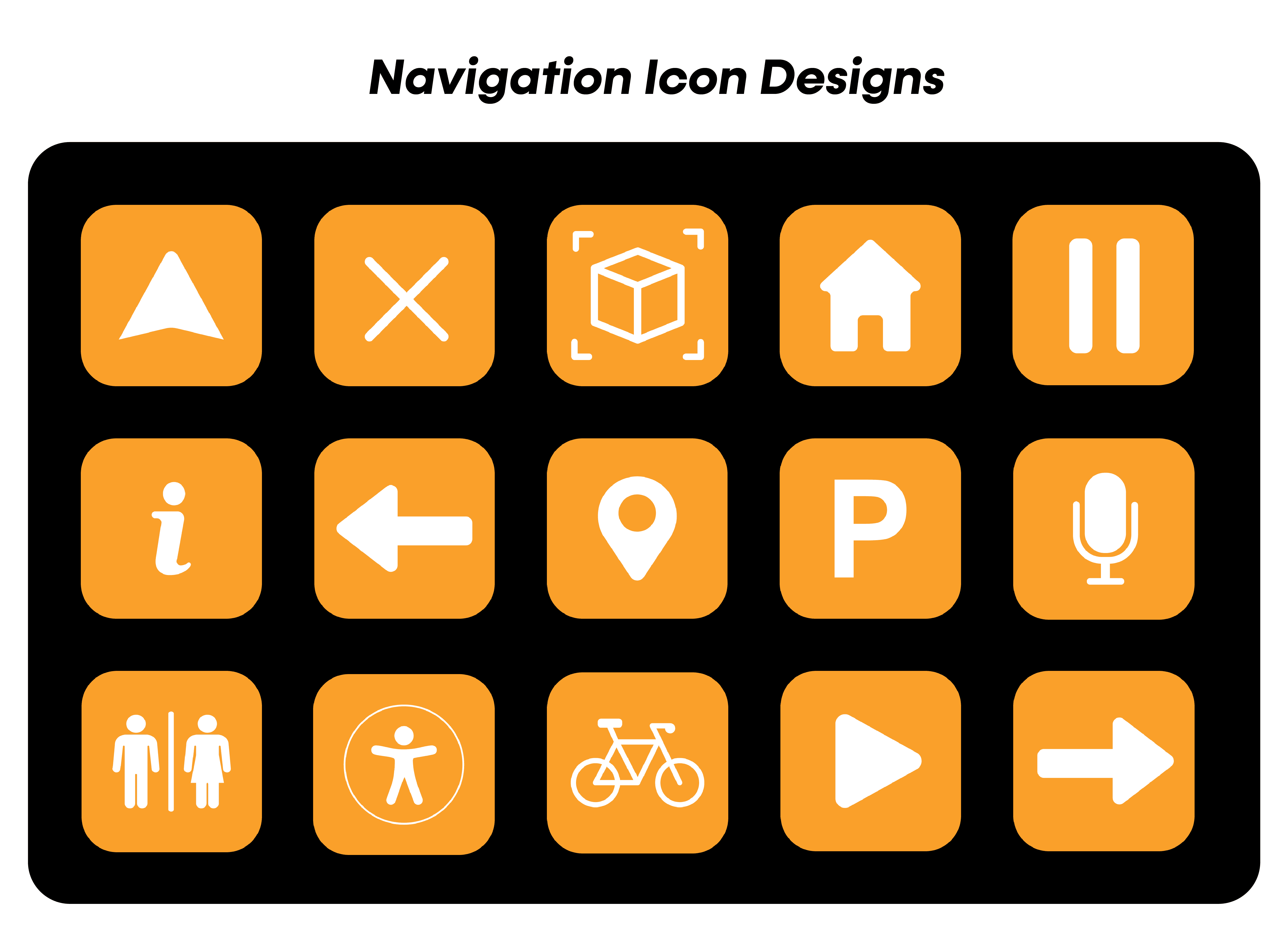
The navigation icons for the app were considered to be as important as any other component of the application. The team member responsible for the icons consulted the rest of the team regarding the icons. The main topics of discussion were accessibility and the effectiveness of communication through imagery. The icons designed prioritized using fundamentally understandable imagery to depict locations and activities on the park grounds.
The navigation icons for the app were considered to be as important as any other component of the application. The team member responsible for the icons consulted the rest of the team regarding the icons. The main topics of discussion were accessibility and the effectiveness of communication through imagery. The icons designed prioritized using fundamentally understandable imagery to depict locations and activities on the park grounds.
